Zomato vs Swiggy - A Heuristic Evaluation
Swiggy and Zomato have grown to become India’s giants for food delivery and ordering. Personally, while ordering, I tend to switch between Zomato and Swiggy now and then. It’s one of those days when it occurred to me that a quick heuristic analysis might help me choose better. Here is a quick comparison of the 2 apps based on Jakob Nielsen’s 10 Usability Heuristics.
#1: Visibility of system status
Zomato and Swiggy have visible system statuses at all times.
Zomato includes 2 toggle switches for veg and non-veg, whereas Swiggy has the “veg only” toggle, which filters food choices.
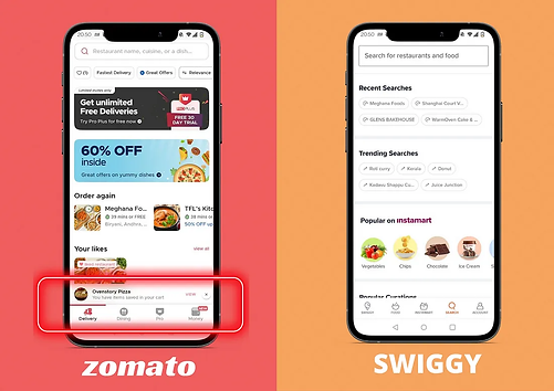
The items in the cart, if any, are always visible as a card at the bottom of the screen. The menu shows “+ ADD” if the item isn’t selected, otherwise, it shows the count of the item.

While Zomato’s cart is visible even on exiting from the selected restaurant, Swiggy’s cart isn’t visible once we exit the restaurant, and is visible only on selecting a restaurant again or while searching for a dish/item.

#2: Match between the system and the real world
Both the applications have labeled icons and offer simple and understandable phrasing to the user.

#3: User control and freedom
In both applications, you can customize orders, repeat previous customizations, provide instructions to restaurants, choose a tip amount, select an offer that may apply, choose any payment method, and delete an item from the cart.
Zomato allows users to opt in for cutlery with the message “please select if completely necessary.”
Swiggy, since the pandemic, allows users to opt for no contact delivery.


#4: Consistency and
standards
Swiggy and zomato have the following typefaces and color palette which is maintained throughout the application.

#5: Error prevention
Here, let’s consider the case when we quit the app and open it to try ordering from 2 restaurants at the same time.
On Zomato, if I add an item from a different restaurant that isn’t currently in the cart, it switches the restaurant order without a warning, and the previous order is lost.
For Swiggy, the cart’s restaurant is present always while browsing through restaurants, and on trying to order from a different restaurant, it provides a modal box warning with an option to switch restaurants.

#6: Recognition rather than
recall
Both applications perform well here as they have well-labeled icons that guide the user through the ordering process. The user profiles in both applications have well-labeled icons too, and each has a specific call for action.

#7: Flexibility and efficiency
of use
Both applications are flexible and efficient as they allow freedom to:
-
Choose to tip any amount or choose not to tip
-
Choose from any coupons on the list of offers
One of my favorite features of the application is “Recent Orders,” which allows us to order our favorite items again.

#8: Aesthetic and minimalist
design
Zomato’s icons are filled, whereas Swiggy uses outlined icons. Zomato’s menu icons are more rounded than Swiggy 's, but both applications have a high signal-to-noise ratio without a lot of distractions ( except the offers they have in the respective applications )
As the application needs to present images of varied hues and shades, the white background allows the design to be minimalistic.
Their landing pages are pretty similar in the structural breakdown too.

#9: Help users recognize,
diagnose, and recover
from errors
Consider cancelling an order.
Zomato doesn’t allow the cancellation of orders with a refund, and it provides this information in red color while placing the order, whereas
Swiggy allows the cancellation of orders for 60 seconds after placing them and has a dedicated section to explain its cancellation policy, which keeps its user well informed.

#10: Help and documentation
Zomato has a section named ‘ Online ordering help’ in the user’s profile, which is a virtual personal assistance bot. The navigation to this help menu wasn’t very intuitive as it did take me some time to know that the default user profile mug image would guide to user’s profile screen.

Swiggy’s help and documentation are clearer by intention as the user profile icon is present on the navigation bar and on-click, help option is visible distinctly with diverse subsections which helps guide its user better.
